Search
Close this search box.

To learn more about submitting a post for the ISSOTL blog, visit the ISSOTL Blog submission page.

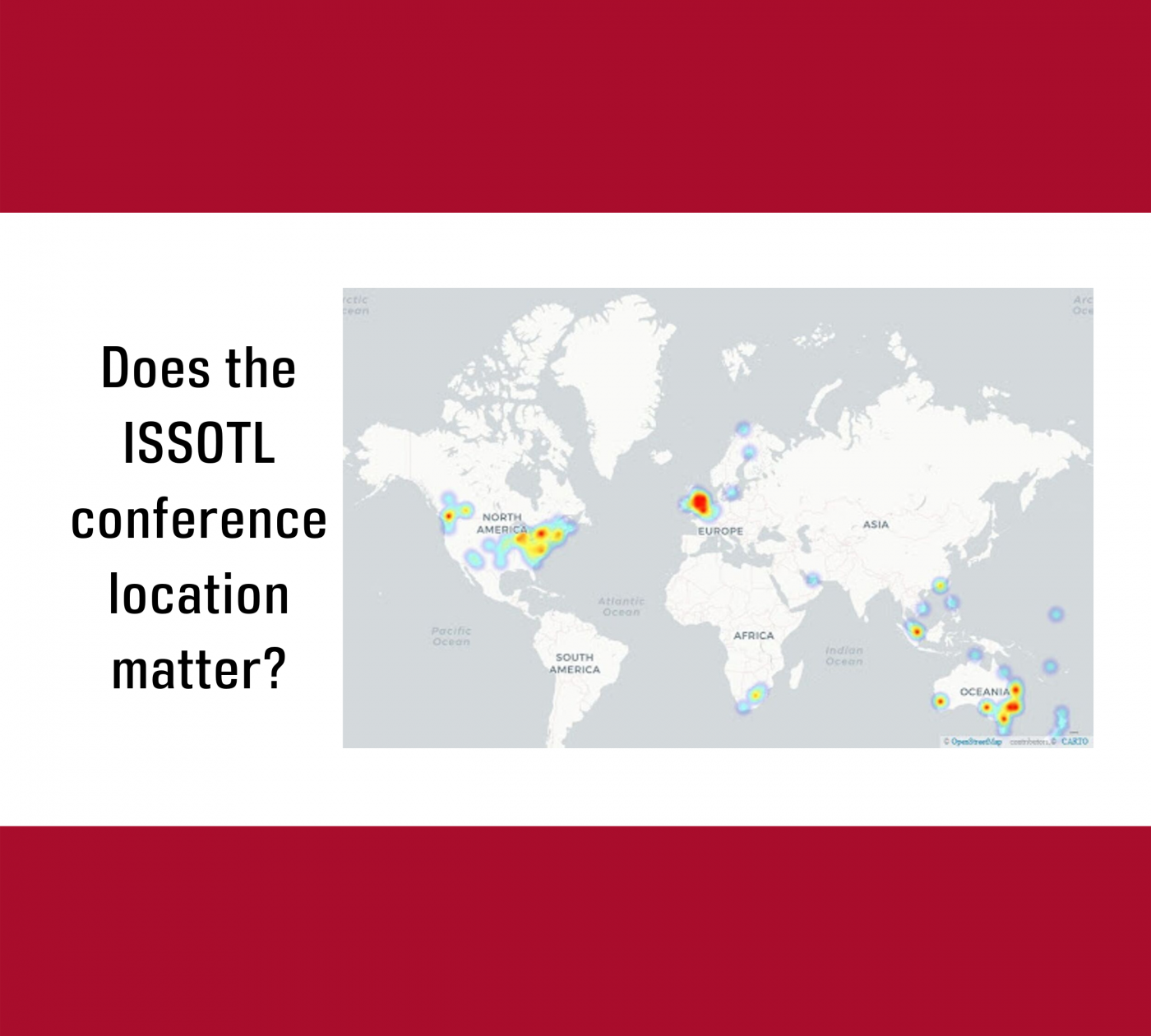
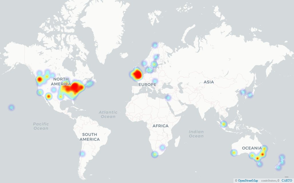
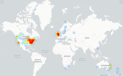
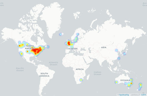
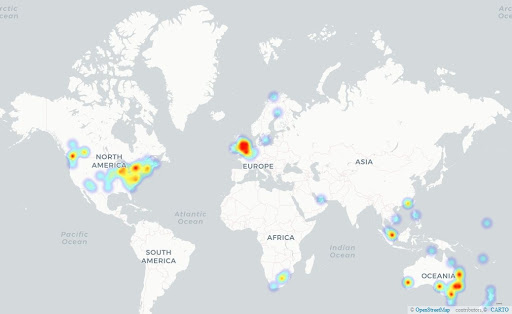
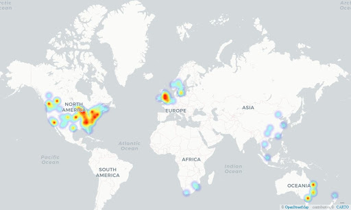
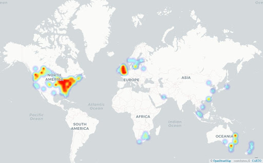
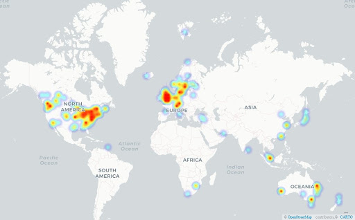
Where do presenters at ISSOTL come from and what can this tell us about SoTL? Part one: An International society

Brian Jackson, Associate Professor, Mount Royal University, bjackson@mtroyal.ca
Margy MacMillan, Professor Emerita, Mount Royal University, margymac@gmail.com

Does the ISSOTL conference location matter? Our work shows that hosting a conference has a definite short term impact on local interest in SoTL – information that might be useful to those making a case for hosting to their institutions and sponsors. We don’t think this result surprises anyone, but using maps as an investigative tool revealed that the relationship is more complex than it appears and raised other questions about SoTL cultures. SoTL folks may also find maps as data presentation interesting. We rarely see maps in SoTL, but they could be useful in presenting data on students, areas students choose to research, locations for field work, or other studies of SoTL work.

We used information from conference programs to map the institutions behind the people presenting at ISSOTL conferences from 2012-2018. Some of this data was obtained through publicly available programs, and some through Margy’s work on recent conferences. In our analysis:

  • We used only the main program, not any subsequent updates.
  • We counted all presenters from each institution once for each conference regardless of how many presentations they were involved with.
  • Being listed in the program doesn’t necessarily mean the person came to present.
  • People move around. We counted presenters as members of the institution recorded in each year’s conference program.

We totalled the number of presenters from each institution for each conference and developed a massive list of institutional street addresses that Brian used to map the data. 

From data to maps

Brian used Google Maps to geocode street addresses to longitude and latitude coordinates for export into ArcGIS to allow for much better analysis of geospatial data and much more interesting maps.

He used ArcGIS to calculate the ‘as the crow flies’ distance between each represented institution and the conference location for each year to show the relative proximity of each presenter’s institution to the host site. He then exported spreadsheets from ArcGIS that included the names of each institution, the conferences at which each was represented, the number of presenters from each institution, and the distance between those institutions and the conference location to complement our visual analysis of the maps.

As you can see from the maps below, each ISSOTL conference has its own pattern of presenters. These maps show both a core group of ‘frequent flyer’ institutions, consistently represented at all conferences, and strong showing by presenters from institutions in the immediate region. A local conference is usually less expensive to attend than a distant one, making it easier for those new to SoTL or without significant professional development budgets, such as students and precarious/contract faculty and staff, to participate. These maps raise questions for further study, including:

  • What are national/regional differences in SoTL that impact presenting at conferences?
  • Whose voices aren’t (yet) part of the conversation?
  • Are there differences in SoTL in zones that are hot (red) and those where it is more dispersed, but still present (blue)?

Heat Maps, 2012-2018: 

Hamilton, 2012

Raleigh, 2013

Quebec City, 2014

Melbourne, 2015

Los Angeles, 2016

Calgary, 2017

Bergen, 2018

Frequent flyers

As the maps show, certain institutions always send presenters to ISSOTL, regardless of conference location. The “frequent flyers” that sent at least one presenter to conferences in all 7 years of the study are:

  • Elon University
  • Georgia Southern University
  • Lund University
  • McMaster University
  • Mount Royal University
  • Queensland University of Technology
  • University College Cork
  • University of Auckland
  • University of British Columbia
  • University of Calgary
  • University of Queensland
  • University of Toronto

In an upcoming blog post, we’ll look more closely at the nature of participation by frequent flyer institutions.

This data raises some interesting questions for further study. If presenting at ISSOTL is a proxy for SoTL involvement, there are lots of directions here for further research, including:

  • What are the common features of these ‘frequent flyer’ institutions and can they be replicated? 
  • Is there an impact of regional clustering – e.g. in the Georgia/North Carolina area, Melbourne, Calgary, or Sweden/Norway that might be evident in collaborative work between scholars at different institutions?
  • The list includes institutions that vary by size and mandate – what factors don’t affect SoTL participation?
  • What other factors spark the spread of SoTL – faculty moving from place to place, government or consortial priorities and initiatives, or diffusion along disciplinary lines?

And most importantly,

  • What questions do these maps spark for you?

With thanks to Karen Manarin for reviewing and improving our work.

Read the second part of this project in Where do presenters at ISSOTL come from and what can this tell us about SoTL? Part Two: A closer look at the ISSOTL maps.”